MAP Studio
Brand Identity and Creative Direction.
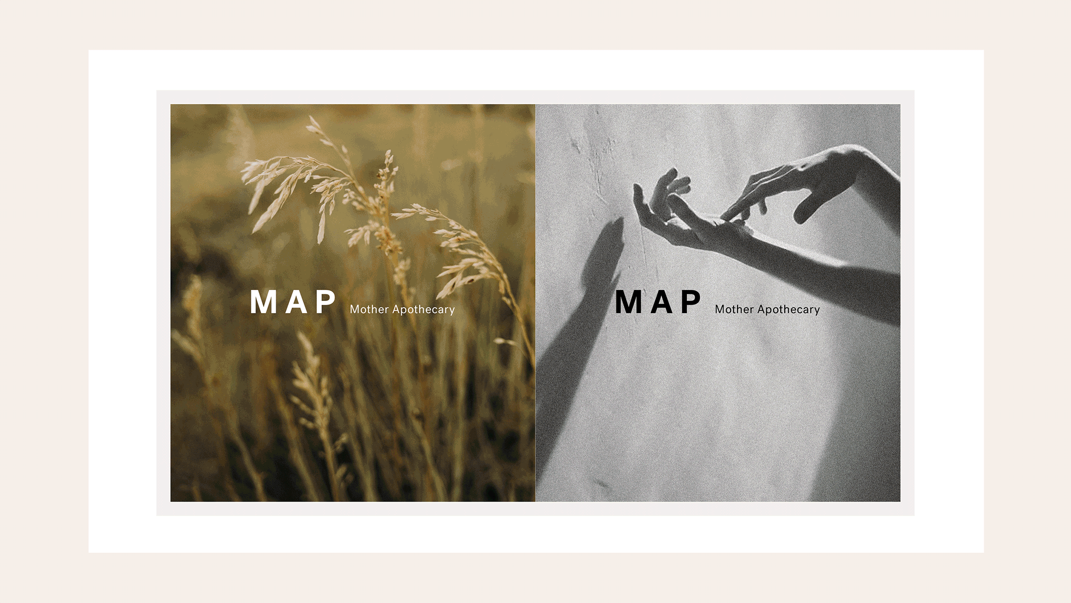
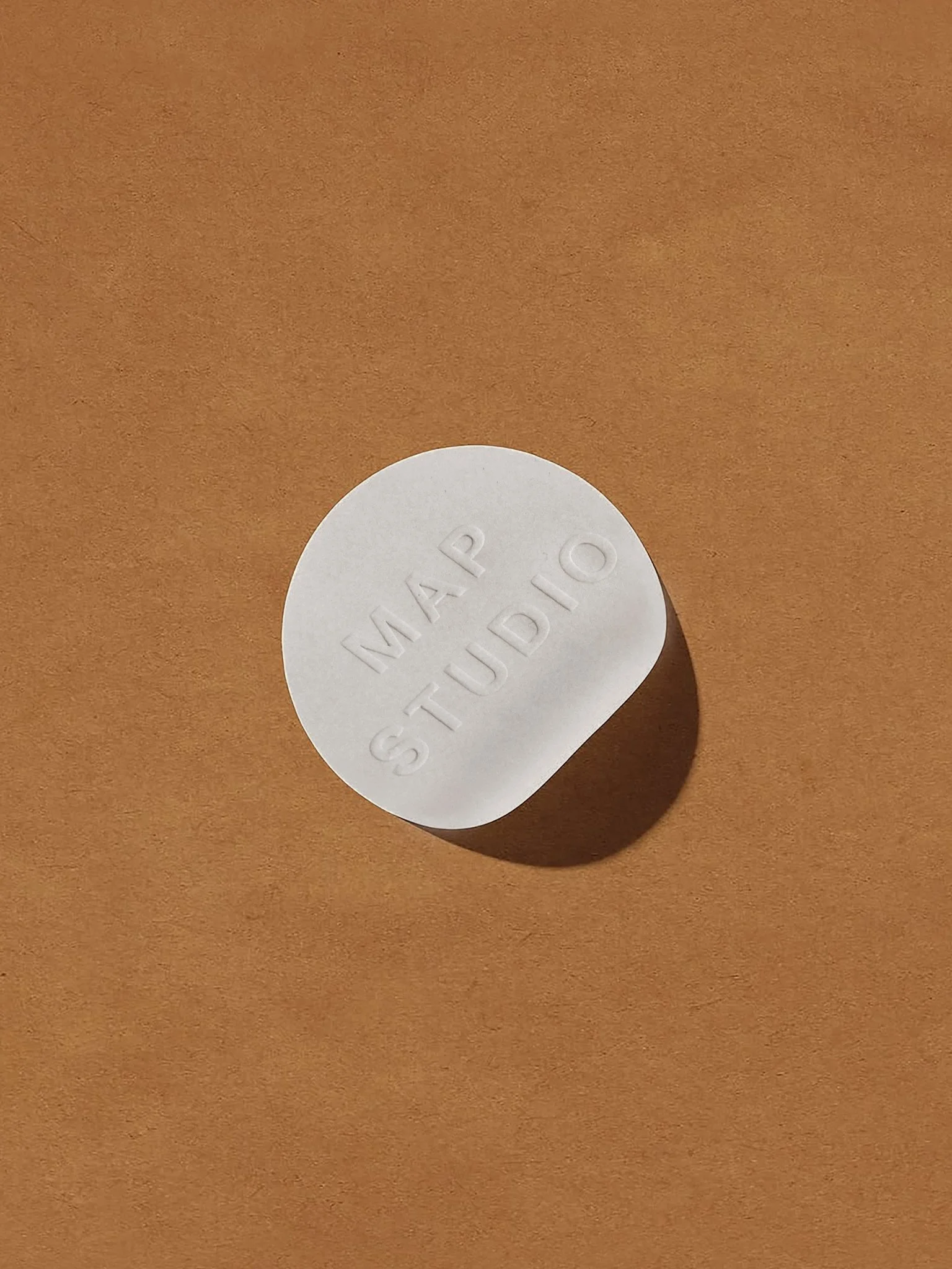
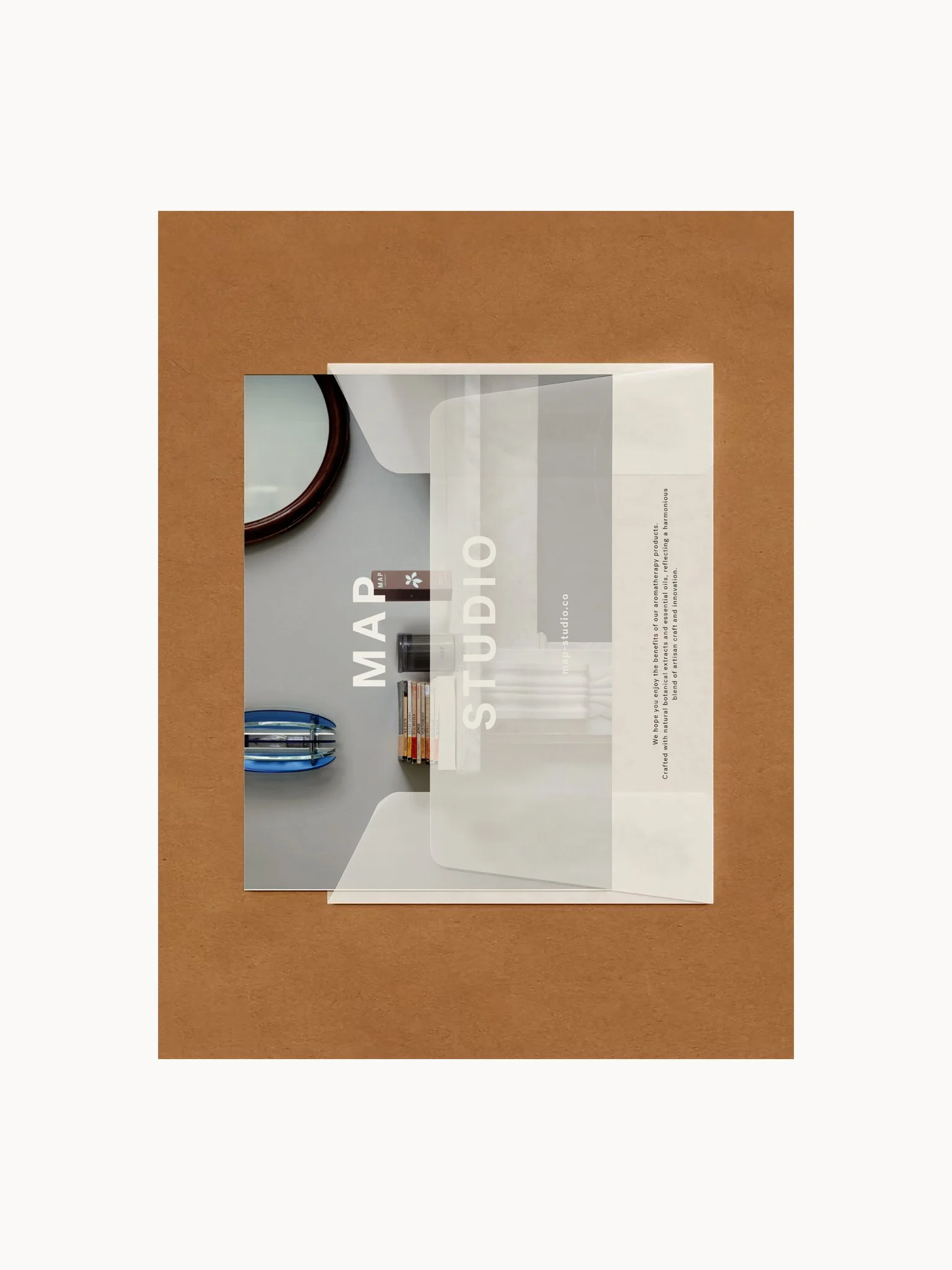
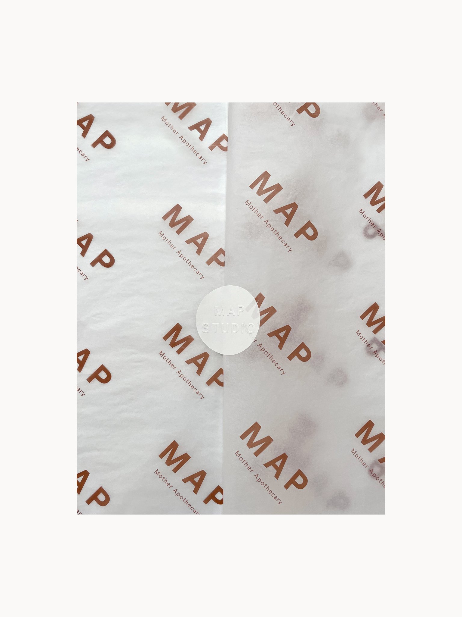
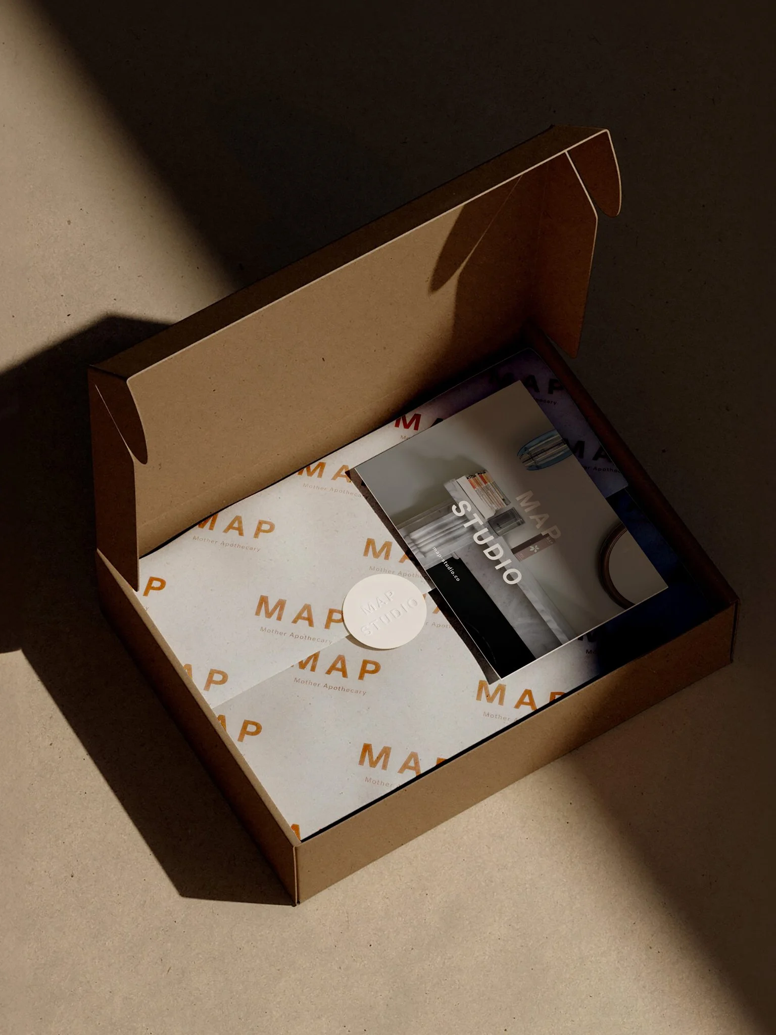
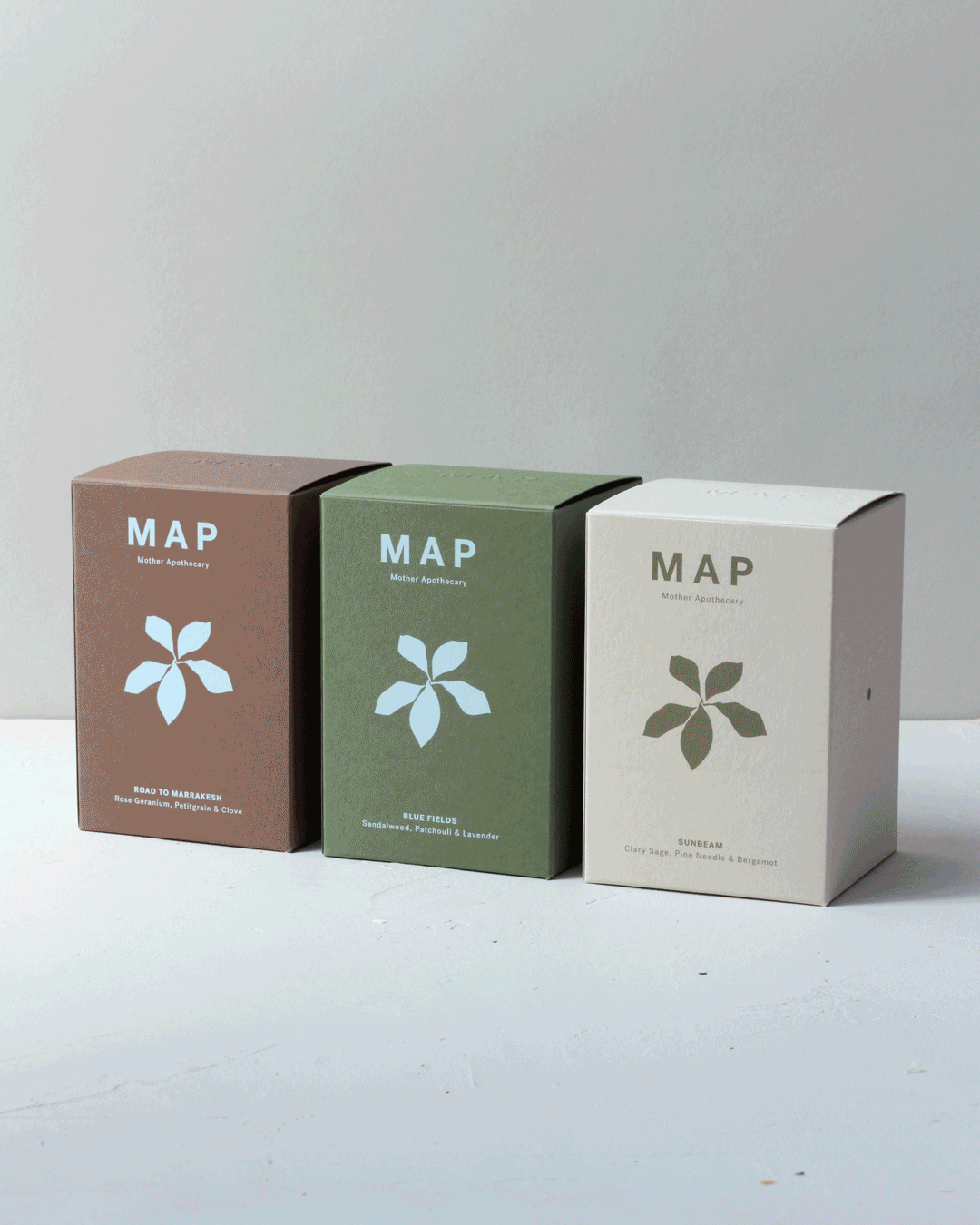
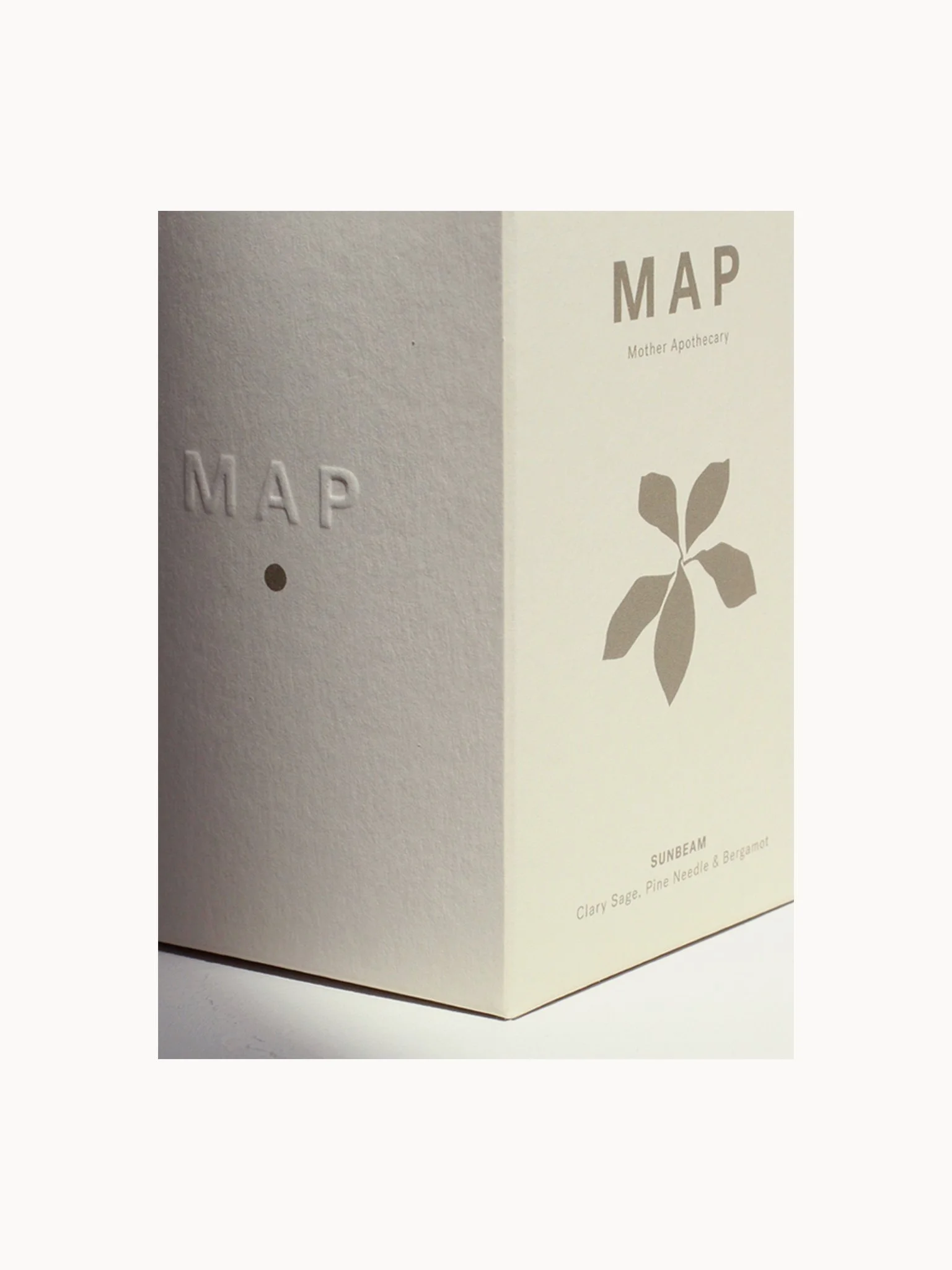
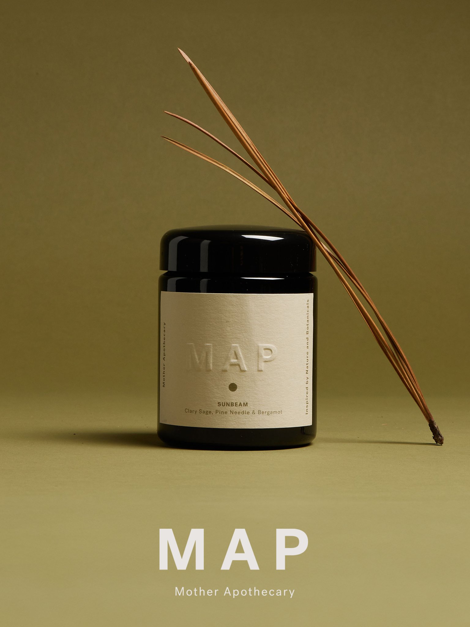
MAP - Mother Apothecary, a modern aromatherapy brand with the aim of re-connecting our own environment and surroundings to nature. The brief was to create a clean logo that could be easily used across the brands product packaging and online platforms. The direction takes a stripped back approach giving greater emphasis on the earthy colour palette. Being inspired by nature and botanicals, references to plants are made whilst keeping a tactile and clean approach with the use of a blind embossed logo.